
In this article, we will review different ways to customize the appearance of your Phoca Cart online store. We will begin with using simple Helix template presets and then review how to use CSS selectors to customize a few of the most important elements.
Using Helix Presets to Customize Phoca Cart
Click on Dashboard, Templates Styles. Then click the Helix template to edit it. Then click Presets to see this screen:
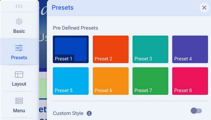
Helix comes with 8 different color combination presets as well as giving us the ability to turn off all of the Presets and just use our own Custom Styles. Currently, our website is using the dark blue preset.
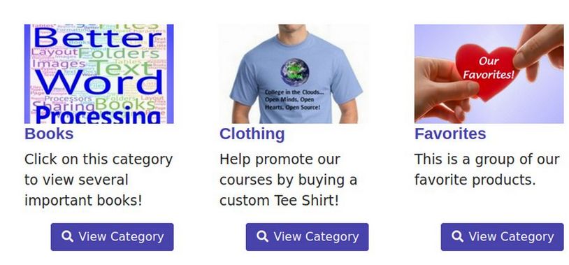
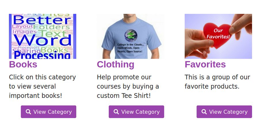
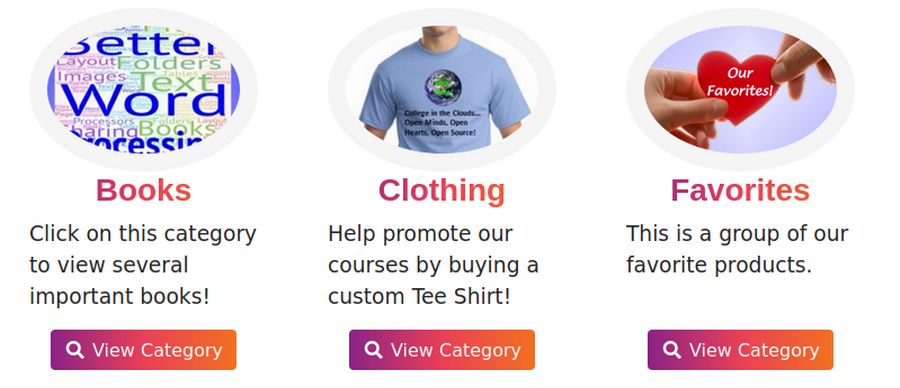
Here is what the dark blue preset looks like for our online store Categories View in the front end of our website:
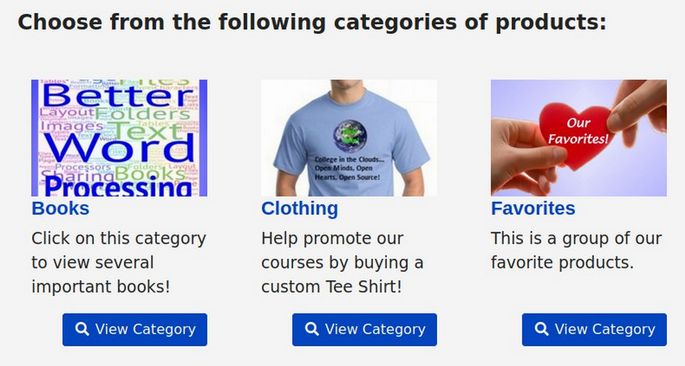
Click on a Category to see the Category View:
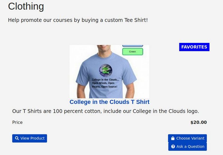
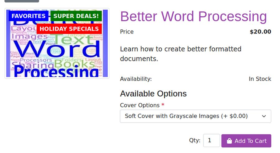
Then click View Product to see the Product View
Now change the Preset from Blue Preset 1 to Purple Preset 4. Then click Save and view the result in the front end.
All that changed was the color of the titles and the background color of the buttons. Hover over the Preset 4 box to see the Edit pencil. Then click on it to edit Preset 4.
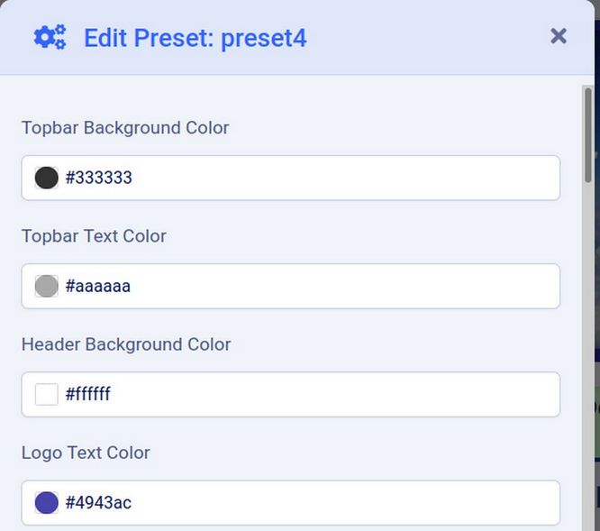
Scroll down the screen and you will see that there is no option for adjusting the title text color or the button background color. However, change the Body Link Color from #4943ac to #9943ac:
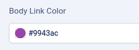
Click Apply. Then save and view the result in the front end.
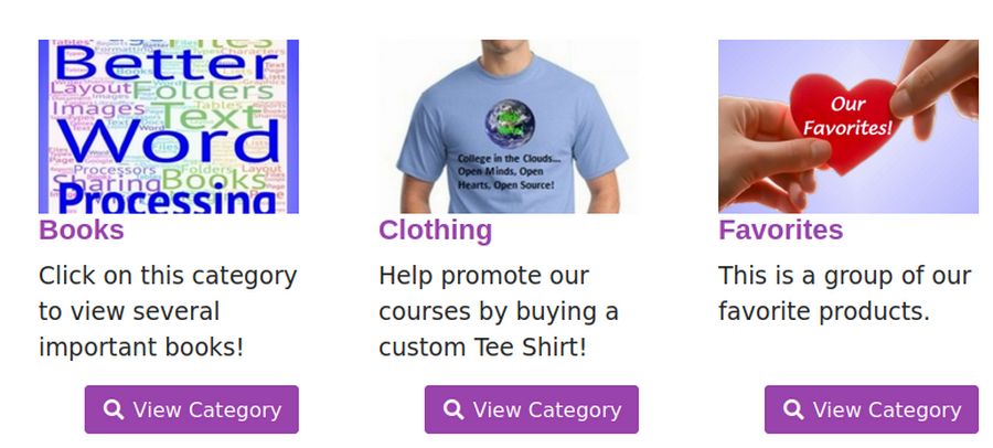
Surprisingly, changing the Preset Body Link Color changes BOTH the Title Color and the button background color!
Use FireFox Web Developer Tools to Discover the CSS Classes
Using Firefox Web Developer Tools, we can discover that the titles in Categories View are h3 elements controlled by a class called ph-category-header.
Product titles in the Category View are h3 elements controlled by a class called ph-product-header.
Product Titles in Product View are h1 elements controlled by a class called ph-header.
The button background color is controlled by classes called btn-primary and btn-primary:hover.
Use Helix Topography Settings to Change Title Font Sizes
Sadly, the default font size for the h3 category titles is very small. To increase this font size, go back to Template, Styles and click on the Helix template to edit it. Then click Typography and turn on Heading 3. Change the font to Arimo, the weight to bold and the Size to 28px.
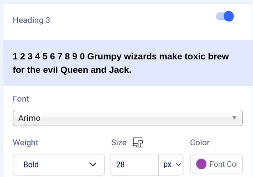
Then click Save and view the result in the front end:
To change the font color for the H1 Product Title, turn on the Heading 1 element in Typography and set its color for #9944ac:
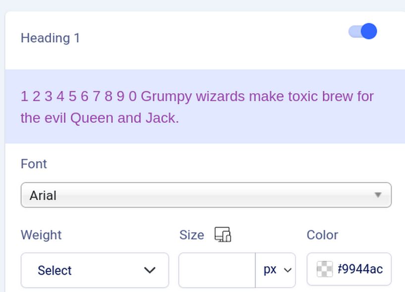
Then click Save and view the result in the front end on the Product View page:
Add CSS to the Custom dot CSS file
There is only a limited number of changes that can be made with the Helix Preset and Typography settings. For more complex customization, you can add CSS to the bottom of the custom dot css file. As an experiment, copy paste the following CSS to the bottom of the custom dot css file:
/* Phoca Cart Custom CSS */
.ph-mega-menu-content-module-box .ph-image,
#ph-pc-categories-box .ph-item-content a .ph-image,
#ph-pc-category-box .phIBox .ph-image,
#ph-pc-item-box .ph-image-full,
#phQuickViewPopup .ph-image-full {
border-radius: 50%;
border: 1em solid #f5f5f5;
padding: 0;}
#ph-pc-category-box .b-thumbnail,
#ph-pc-categories-box .b-thumbnail {
border: 0px;}
#ph-pc-categories-box .ph-item-content .ph-pull-right,
#ph-pc-categories-box h3 {
text-align: center; float: none;}
.ph-mega-menu-content-header,
#ph-pc-category-box h3,
#ph-pc-categories-box h3,
#phQuickViewPopup .ph-header,
#ph-pc-item-box .ph-header {
background: linear-gradient(to right,#8A2387, #E94057,#F27121);
-webkit-background-clip: text;
-webkit-text-fill-color: transparent;
-webkit-box-decoration-break: clone;
box-decoration-break: clone;
text-shadow: none;}
.btn-primary { color: #fff; background: linear-gradient(to right, #8A2387, #E94057,#F27121) !important; border: 0px !important;}
.btn-primary:not(:disabled):not(.disabled):active:focus,
.btn-primary:not(:disabled):not(.disabled).active:focus ,
.btn-primary:focus,
.btn-primary.focus {
box-shadow: 0 0 0 0.2rem rgba(219, 27, 98, .5) !important;}
.btn-success { color: #fff;
background: linear-gradient(to right, #085078, #309488) !important; border: 0px !important;}
.btn-success:not(:disabled):not(.disabled):active:focus,
.btn-success:not(:disabled):not(.disabled).active:focus ,
.btn-success:focus,
.btn-success.focus {box-shadow: 0 0 0 0.2rem rgba(48, 148, 136, .5) !important;}
.ph-desc {margin-bottom: 0em;}
.ph-desc, .ph-items, .ph-categories, .ph-subcategories { margin-top: 0em;}
.ph-video-container iframe, .ph-video-container object, .ph-video-container embed {width: 60vw; height: 60vh;}
.fa-download {width: 4em; height: 3em; line-height: 3em;}
Then click Save and Close and view the result:
There is a lot more you can do to change the appearance of your online store images, titles and buttons – and you do not need to be an expert on CSS. There are many free online button CSS generators you can use to create button CSS which you can then copy and paste into your custom CSS file.
What’s Next?
In our next chapter, we will review steps you can take to promote your online store.